Book layout

Layout of a book based on my own research, focusing on the analysis of the graphic design of the logos of terrorist organisations that existed in Spain from the late Francoist period until well into democracy.

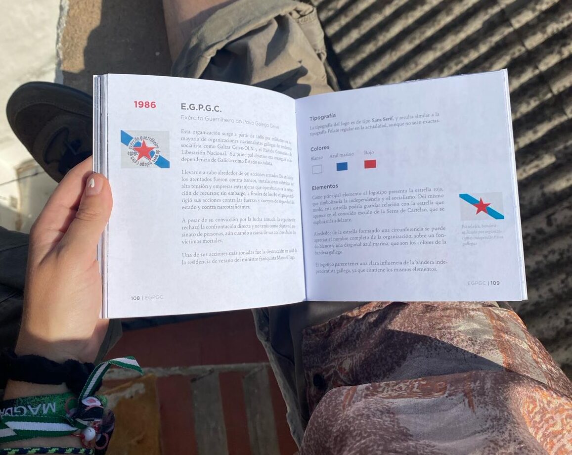
The analysis focuses on the fundamental aspects of the graphic design of the logos, including typography, colours, the different elements that make up the logo, the complexity of the design and its reproduction in different media, while contextualising each graphic brand within its respective historical and ideological environment.

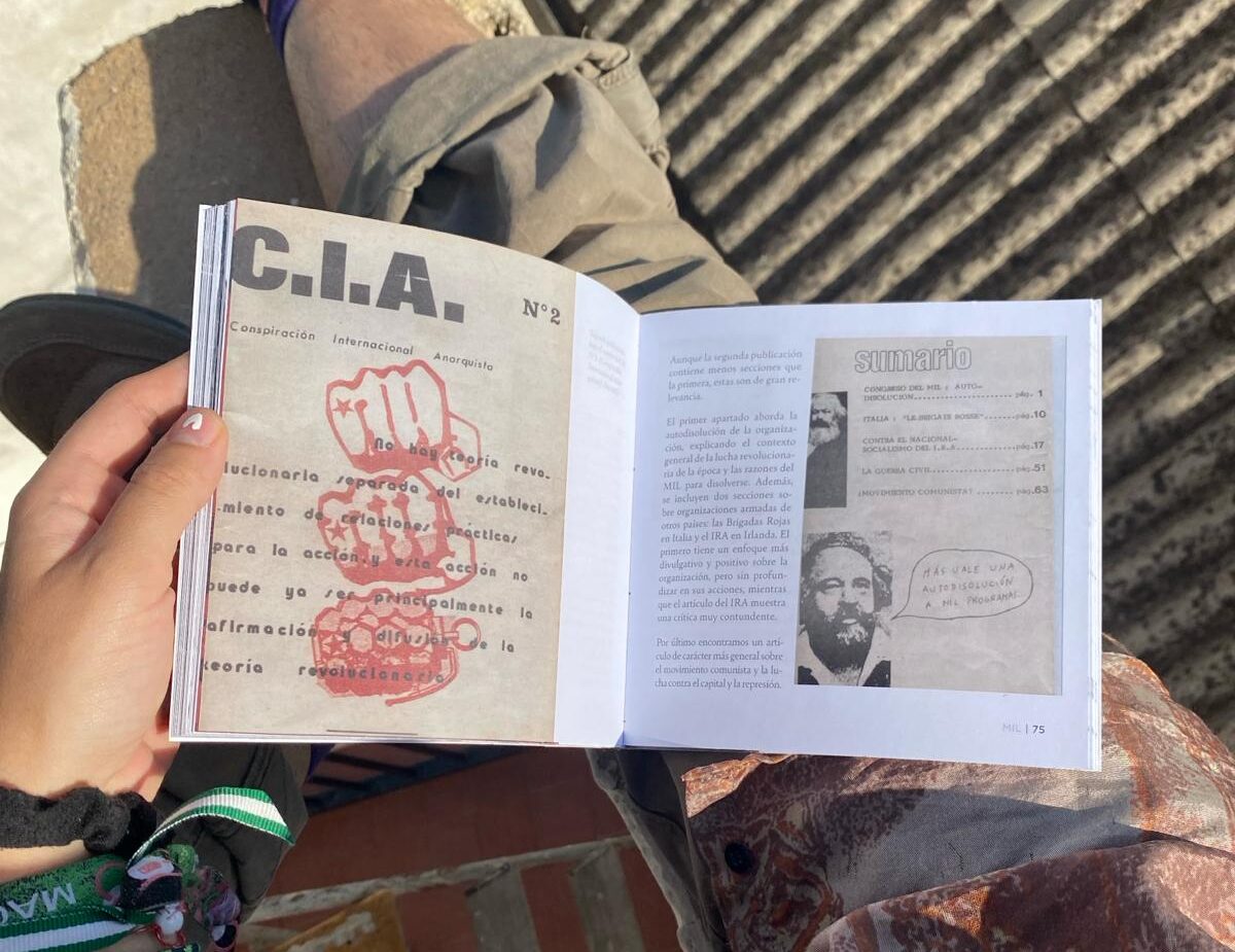
As a general framework, this work aims to introduce us to a dimension of design that is not studied and is deliberately ignored: the graphic design of clandestine armed organisations created by non-professional authors.

01

Colours

The only colour used throughout the book is black, chosen for its symbolic connotations associated with death, terror and fear, elements related to terrorism. On the other hand, white is used passively as a background, creating a strong contrast with black, as it symbolises peace and purity.

02

Fonts

I chose the Escolar script font, which imitates school calligraphy, for the cover and section headings. In addition to creating a certain contrast with the theme, it also evokes a sense of learning, which is fundamental to the informative approach presented in the book.

For the body of the text, I used the Bely font from the Serif family for its legibility in written format, while for the titles I chose the Gotham font from the Sans Serif family for its visual impact and modernity.

03

Margins

I have chosen wide outer margins (in blue) of 46 mm so that I can include additional information and small images on the sides. This choice not only adds visual appeal, but also improves readability and conveys a sense of seriousness. The inner margin (red) is 14 mm, creating an aesthetic space that enriches the composition.

As for the top and bottom margins, the top margin (green) is 16 mm, while the bottom margin (yellow) is 20 mm, thus balancing the distribution of space on the page.

04

Grids

To ensure uniformity and consistency, different grids have been used on the master pages. The grids shown here are designed to organise the composition of images in the presentation of the organisations, as well as the structure of the home page, which contains basic information about the designs.

Scroll to Top