Signs and signage

Redesign of the signage for the Faculty of Labour Relations and Human Resources in Granada, incorporating the new logo and applying the corporate colour.

The main objective was to update the faculty’s visual identity, improving both the aesthetics and functionality of the signage.

01

Registration of old designs and measurement taking

I took photographs of the signage as it was before. The faculty had old signs that used the old logo and lacked visual consistency between areas.

As I did not have a record of the measurements, I had to dismantle most of the signs in order to adapt the new designs, as not all the signs were the same size.

Old signs

02

Review of new corporate identity manual

Before beginning the redesign of the signs, I carefully read the faculty’s new visual identity manual.

I applied the main corporate colour and typography (Barlow Condensed), seeking to reinforce the faculty’s visual recognition.

I made the first sketches of the signs:

Manual, colours and logo

First sketches

03

Design of signs for the Faculty of Labour Relations

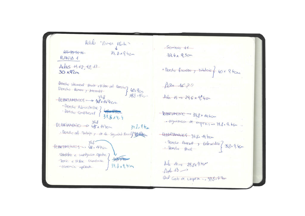
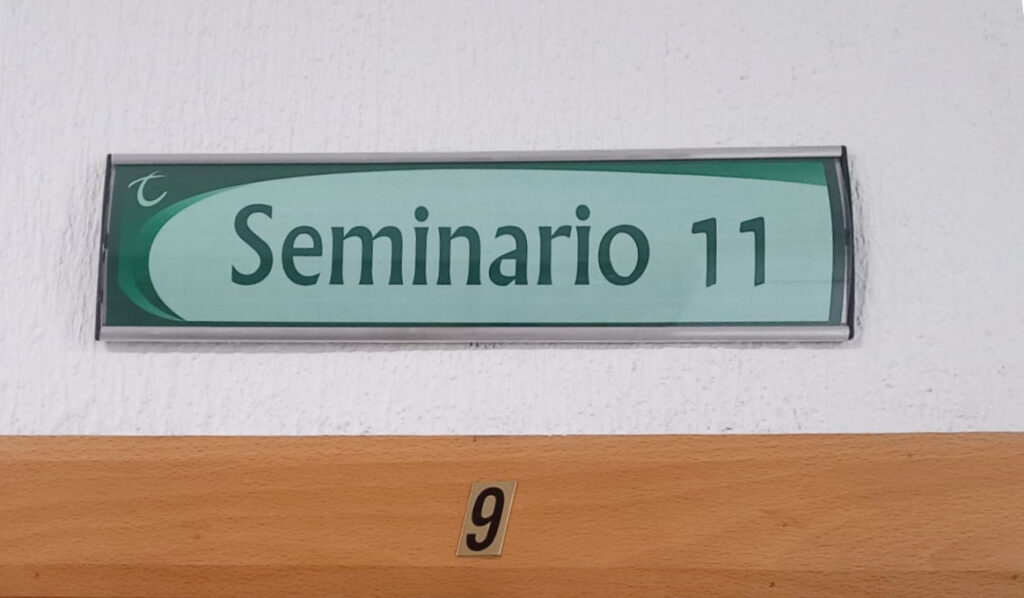
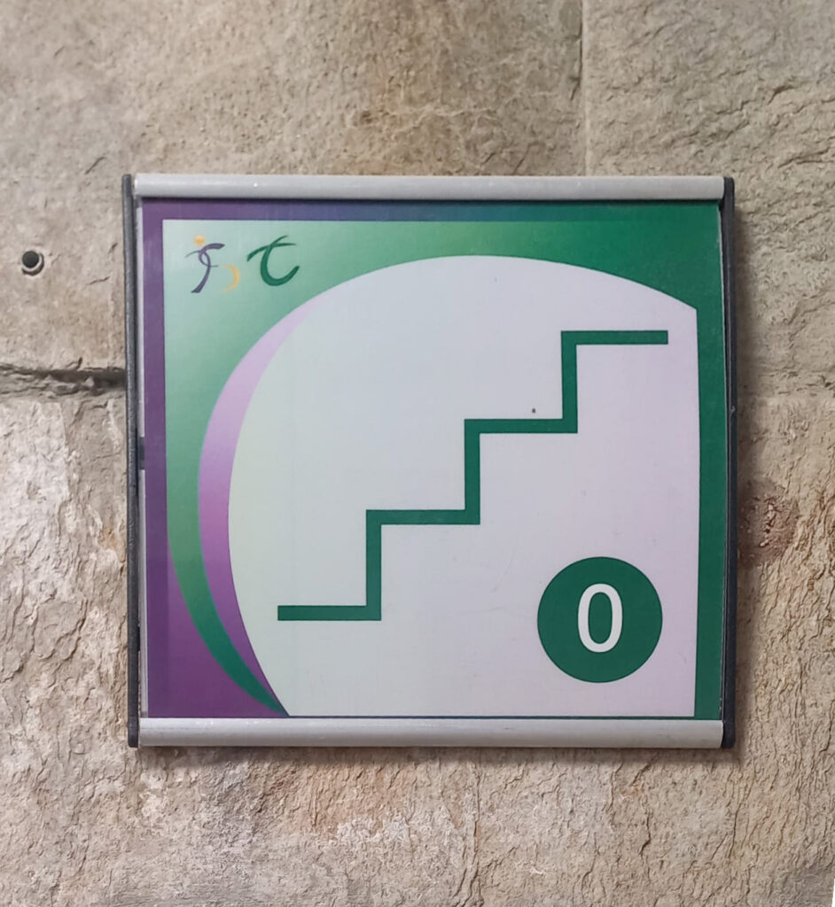
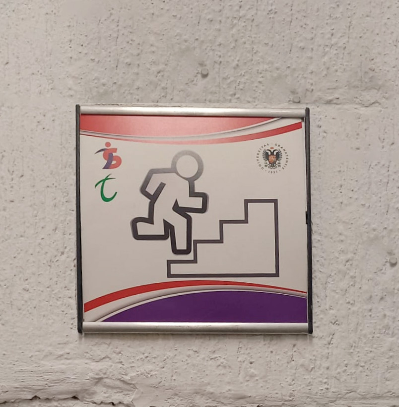
Based on the initial sketches, I defined a proposal for signage that combined the logo and institutional colours.

I wanted to maintain a clean and simple design, but with attention to detail, conveying a clear and professional image of the faculty. Although only a sample is presented here, I designed more than 70 signs in total.

04

Visual coexistence between brands

During the development of the project, the need to design shared signage with the Faculty of Social Work appeared (since both faculties share the same building), such as signage for services or stairways.

To ensure visual and institutional consistency between both brands, I created a common proposal that coherently and attractively integrated both faculty logos and their corporate colours.

Websites for both faculties with their corporate colours

Own design of integrated signage

Scroll to Top